We have almost ready the UI and logo of the game, we have been doing a lot of studies and variations for some of them, so this particular subject took a while.
First of all lets show the UI icons.
The UI of the game is pretty simple, we need indicators for every action of the player so we don't need to waste time on a tutorial for this simple and short game. We also needed a proper menu so the player can fin the key items and collectibles there and read the description in order to have more context about them.
Image 1: Font.
The font used for the entire game (titles and text) is Segoe Print.
Image 2: Pause menu.
For the pause menus we decided to make a book, specifically a diary, since our protagonist Maria finds missing pages from the diary of her grandma.
Image 3: In-game icons.
We used the same font for the keys that are being show through the game, in this case the WASD and arrows are only shown at the beggining.
Image 4: Quick-time event icons.
This is the circle and click UI for the digging quick-time event.
Image 5: Dirt patches.
This are the dirt patch and layers of the minigame.


Image 6: Item icons.
This are the items that the dog, Sebastian, will dig. The page is the icon for the missing pages that are the key objects, the glasses, teapot and garden shovel are the collectibles.
With this we have all the final icons that will be shown in-game.
The icon of the app took a little longer.
Image 7: First icon concept.
We initially tried with the front face of Sebastian, but with the lines of the 3D model it just doesn't feel right. We also tried the background to be the seasons of the game.
Image 8: Second icon concept.
Removing the lines was even worse, since it's hard to noticed what the drawing is about at all. Detailing more would take time and didn't seem to be the best option.
Image 9: Third icon concept.
We changed our minds and experimented with the profile silhouette of Sebastian and it did fit better, but the background with the seasons didn't fit anymore with this version, so we choosed to made it just white.
Image 10: Final icon concept.
The logo was the hardest to figure out.
Image 11: First logo concept.
Previously we already had this concept, and we liked the idea of Maria and Sebastian on the logo, but it was too noisy here and the font didn't fit.
Image 12: Second logo concept.
We tried using the font of the normal text for the title too and it did fit, but we had to work more with the rest.
Image 13: Third logo concept.
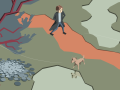
We reached this concept of the path and the characters behind or on top, but with a minimalista art-style.
Image 14: Logo variations.
Then started to experiment different concepts with that base.
Image 15: Final logo concept 1.
Image 16: Final logo concept 2.
Finally we got this versions with the text better highlighted.
We have a week left for the release of the vertical slice, so we have almost ready a playable build and will be informing here about the final narrative and tests.