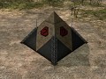
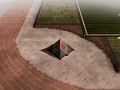
Kane's Pyramid - In game
(view original)

Post a comment
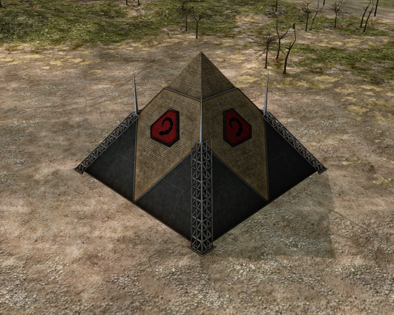
Description
Structure series: 4 of 4.
While this is not exciting, I feel that there is enough to work with in the future.
That is all I can ask for from a first pass at modelling and texturing, something to build upon when it comes time to rig, add lighting, and finally animations.
A better modeller than me could have done significantly more to make this look interesting I feel.
the only difference I see from the screen grab is the red glow around the Nod symbol and what seems to be light sources to the side of the symbol.
Huh, never realised that the brown area are really just bricks. Gives the whole thing a soviet vibe :D
I remeber the TS one being a bit wider, but thats a minor detail for a RTS.
However, I got one small suggestion: Reduce the color saturation for the brown parts a bit and darken the top slightly to make the distington between peak and base more visible.
Would love to see a version with some red lights on it. :)
I agree with this.
I am unsure about this, although I will take it into consideration.
Thanks for your comment.
If you can, add an animation with the lights.